Project: “HEEYA TATTOO”
In collaboration with HEEYA TATTOO, a fine-line tattoo artist known for her precision and x-ray style realism, I developed a bespoke brand logo that reflects her artistic voice and refined aesthetic. Through in-depth conversations and a dive into her portfolio, I created a design that celebrates her signature line-work and healing-centered philosophy, while also capturing the warmth and trust she cultivates with each client.
Thoughtful collaboration was central to the design process, with in-depth conversations and exchanges guiding the creative direction. I aimed for a clean, minimalist logo and focused on ideas incorporating the letters “H” and “Y” as well as the Hanja character “喜” (Hee - adj./v. joy, happiness).

After the artist selected a general direction, I began exploring variations in shape and how to approach the “H” and “Y” letterforms. Through this experimentation, I saw an opportunity to break away from the circular container I had worked with. This shift opened up new possibilities, allowing me to introduce additional elements that more authentically captured the essence of her brand.

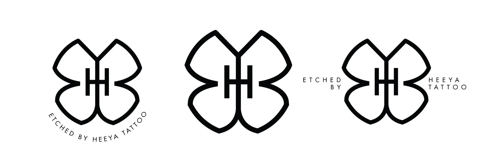
Through this phase, it became clear that the butterfly motif was the distinctive emblem the artist envisioned for her brand. After further discussion and refinement, we struck the ideal balance between bold expression and a delicate sensibility.
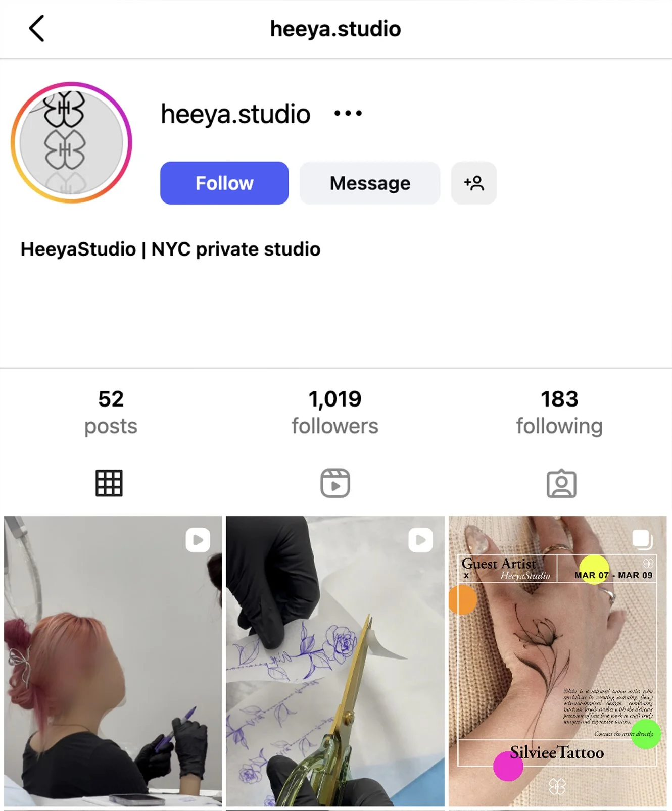
Brand logo placed across a variety of platforms such as social media, digital invites, packaging, merchandise etc.